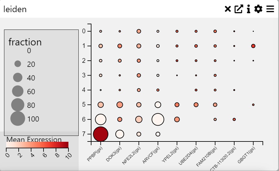
Dot Plot
Examples
Context
A Dot Plot is a graphical representation where individual data points are plotted along an axis to show frequency distributions, comparisons, or proportions. Each dot represents a value, and its size and color can be used to encode additional information. This chart is useful for visualizing categorical data with quantitative measures.
Inputs
- Categories on Y-axis (categorical variable)
- Fields on X-axis (numerical or categorical variable)
Settings
- Chart Name (customizable title)
- Chart Legend (define or modify legend text)
Axis Controls
- Rotate Y-axis Labels (toggle label orientation for readability)
- Y-axis Text Size (adjustable via slider)
- Y-axis Width (modify axis width for layout optimization)
- Rotate X-axis Labels (toggle orientation for better fit)
- X-axis Text Size (adjustable via slider)
- X-axis Height (modify spacing to accommodate longer labels)
- Right Y-axis Size (adjust axis size for layout balance)
Data Processing
- Cluster Rows (group and order rows based on similarity)
- Cluster Columns (group and order columns based on similarity)
- Averaging Method
- Mean (average value calculation)
- Median (middle value calculation)
Color Settings
- Show Color Legend (enable/disable color legend)
- Log Color Scale (apply logarithmic scaling for better contrast)
- Trim to Percentile
- No Trim
- 0.001 (removes extreme values beyond this percentile)
- 0.01
- 0.05