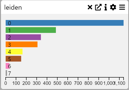
Row Chart
Examples
Context
A Row Chart or Category Frequency Chart visualizes the frequency of categorical variables in a dataset. It helps identify patterns and compare the distribution of categories.
Inputs
- Category (X-axis, categorical variable)
Settings
- Chart Name (customizable title)
- Chart Legend (define or modify legend text)
Parameters
- Category (select the categorical variable to display)
Axis Controls
- Rotate X-axis Labels (toggle orientation for readability)
- X-axis Text Size (adjustable via slider)
- X-axis Height (modify spacing for better label visibility)
Display Options
- Max Rows (limit the number of displayed categories)
- Hide Zero Values (option to exclude zero-frequency categories)
- Sort Order
- Default (original order)
- Size (order by frequency)
- Name (alphabetical order)
- Display as WordCloud (alternative visualization format)
- Show Tooltip (enable/disable tooltip for additional information)