Violin Plot
Examples
Context
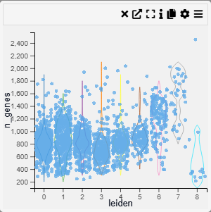
Violin plots combine a box plot with a density plot, illustrating the full distribution shape for each category. Excellent for comparing distributions when you also want to see their shape.
Inputs
- Category (X-axis, categorical variable)
- Value (Y-axis, numerical variable)
Settings
- Chart Name (customizable title)
- Chart Legend (define or modify legend text)
- Band Width (adjustable width for smoothing)
- Intervals (control the number of divisions in the density estimate)
- Point Opacity (adjust transparency of individual data points)
- Point Size (set size of data points for better visibility)
Axis Controls
- Rotate Y-axis labels (toggle label orientation for readability)
- Y-axis text size (adjustable via slider)
- Y-axis width (modify axis width for layout optimization)
- Rotate X-axis labels (toggle orientation for better fit)
- X-axis text size (adjustable via slider)
- X-axis height (modify spacing to accommodate longer labels)
Color Settings
- Color By (choose a variable for color encoding)
- Show Color Legend (enable/disable color legend)
- SymLog Color Scale (apply logarithmic scaling for better contrast)
- Trim Color Scale (adjust percentile range for color mapping)
- Treat Zero as Missing (exclude zero values from visualization)
Tooltip & Interaction
- Show Tooltip (enable or disable tooltip display)
- Tooltip Value (choose which information appears in the tooltip)
- Centre Plot (reset and centre the visualization)
Filtering & Display
- Action on Filter
- Hide Points (remove filtered-out points)
- Gray Out Points (retain but dim non-selected points)