Multi Line Chart
Examples
Context
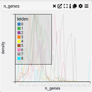
A Line Plot is used to visualize trends and patterns over time or continuous data. It connects data points with lines, making it ideal for identifying increases, decreases, and cyclical patterns.
Inputs
- Value (X-axis, numerical variable)
- Categories (Y-axis, categorical variable)
Settings
- Chart Name (customizable title)
- Chart Legend (define or modify legend text)
- Change Categories (Y-axis) (select or modify categorical grouping)
- Categories to Show (filter displayed categories)
- Stack Lines (toggle line stacking for clearer comparison)
- Fill Lines (toggle fill area beneath the lines for emphasis)
Axis Controls
- Rotate Y-axis Labels (toggle label orientation for readability)
- Y-axis Text Size (adjustable via slider)
- Y-axis Width (modify axis width for layout optimization)
- Rotate X-axis Labels (toggle orientation for better fit)
- X-axis Text Size (adjustable via slider)
- X-axis Height (modify spacing to accommodate longer labels)
Display & Scale
- Scale/Trim to Percentile (adjust the percentile range for data scaling)
- Options:
- No Trim (default, displays full range)
- 0.001, 0.01, 0.05 (trim outliers for focused display)
- Options:
- Band Width (adjustable for distribution smoothing)
- Intervals (set number of divisions for better data segmentation)
- Show Color Legend (toggle visibility of color-coded categories)