Stacked Row Chart
Examples
Context
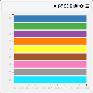
A Stacked Row Chart or Categorical Heatmap is a visualization that represents data through a color-coded matrix. Each cell in the heatmap corresponds to a category on the X and Y axes, with color intensity indicating the value of the relationship between them.
Inputs
- Category (X-axis, categorical variable)
- Category (Y-axis, categorical variable)
Settings
- Chart Name (customizable title)
- Chart Legend (define or modify legend text)
Parameters
- Category X-axis (select the categorical variable for the horizontal axis)
- Category Y-axis (select the categorical variable for the vertical axis)
Axis Controls
- Rotate Y-axis Labels (toggle orientation for readability)
- Y-axis Text Size (adjustable via slider)
- Y-axis Width (modify axis width for layout optimization)
- Rotate X-axis Labels (toggle orientation for better fit)
- X-axis Text Size (adjustable via slider)
- X-axis Height (modify spacing for label accommodation)
- Right Y-axis Size (adjust the width of the right-side Y-axis)
Color & Sorting
- Show Color Legend (enable or disable color legend)
- Sort Order
- Default (maintain the dataset's natural order)
- Size (sort by value size)
- Name (alphabetical sorting)
- Composition (sort based on composition criteria)