Histogram
Examples
Context
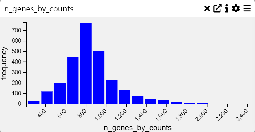
A Histogram is a graphical representation of the distribution of numerical data. It groups values into bins and displays the frequency of occurrences within each bin. This visualization is particularly useful for analyzing the shape, spread, and central tendency of a dataset.
Inputs
- Frequency Data (numerical variable to be plotted)
Settings
- Chart Name (customizable title)
- Chart Legend (define or modify legend text)
Axis Controls
- Rotate Y-axis Labels (toggle label orientation for readability)
- Y-axis Text Size (adjustable via slider)
- Y-axis Width (modify axis width for layout optimization)
- Rotate X-axis Labels (toggle orientation for better fit)
- X-axis Text Size (adjustable via slider)
- X-axis Height (modify spacing to accommodate longer labels)
Data Processing
- Max-Min Values (set minimum and maximum range for data representation)
- Number of Bins (adjust bin count, min: 2, max: 100)